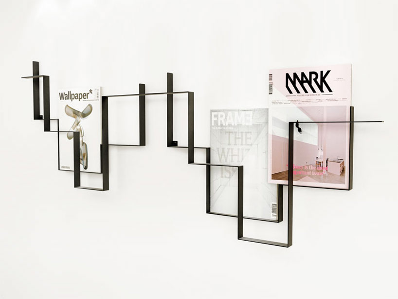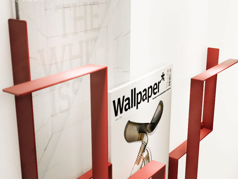


'guidelines' by amsterdam-based design agency fredrik roijé is a minimalist
magazine holder for walls. driven by a search for balanced proportion,
the design consists of two powder-coated metal strips that criss-cross on right
angles to create thin ledges for the periodicals to rest on. the resulting form places
the objects at a pleasant, relational distance from one another, achieving aesthetics
from legibility and functionality.
click here for more
-joel
From the design studio of joel pirela, comes a curated collection of modern architecture, home accessories and current design trends.


